How to create a dial chart dashboard to work with a pivot table for data analysis.
As a data analyst in SkillAhead, one of my key responsibilities is to present to management, a weekly report of the financial health of the organization. I can do this effectively using a simple dial chart KPI dashboard.
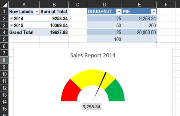
In this tutorial, you will learn how to create a dial chart dashboard for a business, then you will automate the dial chart using the sales information from a pivot table.
In the previous class: Learn how data analyst use MS Excel to create KPI (thermometer) gauge chart, we introduced KPI charts, gave examples of different KPI charts, and created a thermometer chart. You can read up to get this intro.
This tutorial is divided into 2 parts:
- How to create a dial chart.
- How to create and automate a dial chart using a pivot table.
KPI in MS Excel
In MS Excel, KPIs are represented as visual measures of performance. Supported by a specific calculated field, a KPI is designed to help users quickly evaluate the current value and status of a metric (ACTUAL) against a defined target (TARGET).
In Excel, all KPI charts are not there by default, you create them. In Power BI these charts are included in the advanced chart sections.
How to create a dial chart in MS Excel
Step 1. Create the actual and target dataset.

Step 2: Understand the values in the dial chart dataset.
| DOUGHNUT | PIE |
| 25 | 75 |
| 50 | 1 |
| 25 | 124 |
| 100 |
- The Doughnut: the doughnut section will have 4 values. The values will be divided into 2 parts (100 each part). This will help us easily divide the circle into 2 halves. The first 25 will represent poor performance (0-25%), the 50 will represent average performance (26%-75%), the final 25 will represent good performance (76%-100%). The last 100 in the table will be hidden (this will help create the half circle in the chart).
- The Pie: the pie section will have 3 values. The first value (75) is the ACTUAL. The second value (1) is the size of the controller arm. The higher the number the thicker the arm. The third value (124) is the TARGET.
Step 3. Convert it to a table. Select all (with any of the cells selected, CTRL + A). To create a table (CTRL + T).

Step 4: With the table still selected, go to chart, select combo, select create combo chart.

Step 5. The series name has 2 elements, a doughnut and a pie.
- In doughnut, change cluster columns to pie, then select doughnut.
- In pie, change line to pie, then select pie. Check pie as the secondary axis (uncheck doughnut) and click ok.

Step 6: Format the Pie.
Click on the body of the chart (Chart Area), go to “Format”, change the “Chart Area” to “Series Pie”. Then click “Format Selection”.


Step 7. In “Format Data Series”, click on the “Series Option” (the icon with 3 bars).
- Change the “Angle of 1st Slice” from 0 to 270 degrees. (A circle has 4 positions, 90, 180, 270, 360. Point 270 degrees is equivalent to the 9 o clock arm of your wristwatch. We want the pointer to start reading from that position – clockwise).
- Change the “Pie Explosion” from 0 to 400% (So that we can work on each of the points without interfering with the other chart).

Step 8. The pie chart is now separated into 3 points.

Step 9. Click twice on Point 1 to select only “Series Point 1”. In “Series Option”, click the “Fill” tool. Under “Fill” select “No Fill”

Step 10. Repeat “Step 9” for “Series Point 3”. Do not edit “Series Point 2”.

Step 11. Format the Doughnut.
Click on the body of the chart, go to format, change the chart area to “Series Doughnut”. Then click “Format Selection”.
In “Format Data Series”, click on the “Series Option” (the icon with 3 bars). Change the “Angle of 1st Slice” from 0 to 270 degrees. And change the “Doughnut Explosion” from 0 to 200%.

Step 12. The doughnut chart is now separated into 4 points.

Step 13.
- Click twice on Point 1 to select only “Series Point 1”. In “Series Options”, click the “Fill” tool. Under “Fill” select “Solid Fill”, under colour, select “RED”.
- Click twice on Point 2 to select only “Series Point 2”. In “Series Options”, click the “Fill” tool. Under “Fill” select “Solid Fill”, under colour, select “YELLOW”.
- Click twice on Point 3 to select only “Series Point 3”. In “Series Options”, click the “Fill” tool. Under “Fill” select “Solid Fill”, under colour, select “GREEN”.
- Click twice on Point 4 to select only “Series Point 4”. In “Series Options”, click the “Fill” tool. Under “Fill” select “No Fill”.

Step 14. Go to the “Series Option”, select “Series Doughnut” (this will select all the points), return the Doughnut explosion to 0%. Repeat same for the “Series Pie”.

Step 15: Create the Controller Arm.
Go to “File”, then “Options”. Click “Customize Ribbons”, and check/tick “Developer”, and click “OK”.

Step 16. In the “Developer” tab, under “Controls” click “Insert”. In “Form Controls” select “Spin Button (Form Control)”.

Step 17. Double click on your chart area to create a form control.

Step 18. Right click the “Spin Button” and select “Format Controls”.
- Current value = 0 (initial position of the controller arm).
- Minimum value = 0 (the lowest value of the dashboard).
- Maximum value = 124 (the highest value of the dashboard).
- Incremental change = 2 (the steps the controller arm will take anytime it is clicked).
- Cell link = Click the loader arm, select the 3 values in the pie column of the table (75,1,124), load it.
- Click ok.

Step 19. Click on the arrows to see the values change in the table, and the controller arm will also change.

Click here for part 2: How to create a automate a dial chart using a pivot table.
Toyin
March 7, 2023Thanks for the step by step guide
Anietie Etuk
March 14, 2023Thank you madam. Also check our other data analytics classes.